
Kumpulan Perangsang Selangor Bhd (KPS) today unveiled a new brand identity, including a new logo. With the rebrand, which results in a new look-and-feel, KPS takes the opportunity to evolve and communicate its brand more strategically, in the way that will enhance its brand equity, reflecting the Group’s transformation of its business aspirations and cultural shift, which has refined its overall value proposition and future vision.
Business & Culture Transformation
KPS was incorporated 47 years ago, on 11 August 1975. At its incorporation, the vision was to be the catalyst for Selangor state economy in the mining and property sectors. Decades later, the vision evolved, and the focus was redirected towards investment, particularly in the infrastructure and utility sectors, with business activities confined within the state of Selangor.
From 2016 to 2020, KPS embarked on a Business Transformation Plan (“BTP”), with the focus of KPS’ investment operations shifting to the manufacturing sector. The implementation of BTP was to ensure sustainable growth and enhance shareholder value by acquiring scalable assets in high growth areas. In addition, BTP also emphasised cost-effectiveness and prioritised human capital development while working towards a high-performance culture, shaping the Group towards becoming a progressive, dynamic, and resilient investment holding company.
KPS has undergone many transformations in terms of investment strategies and objectives. KPS’ investment operations have shifted from managing state assets in Selangor to investing in companies with a global market presence in several strategic sectors. It also aims to be more resilient and embrace sustainable growth whilst ensuring its businesses are carried out responsibly, placing a strong emphasis on managing risks and opportunities from the environment, social and governance aspects, or ESG.
![]()
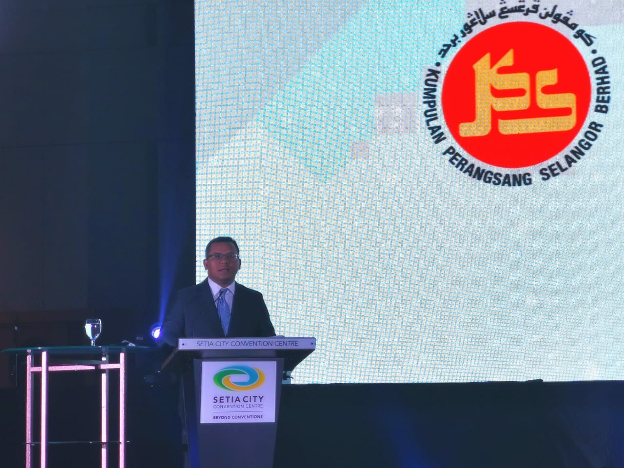
KPS Managing Director and Group CEO, Ahmad Fariz Hassan, said, “While our business has transformed dramatically over the past few years, it became clear that the perception of the Group has not evolved at the same pace, creating a dissonance between the brand identity and the intended brand equity. The new logo exudes qualities such as trust, progressiveness, dynamism, and resilience, better matching how we look to our vision, missions, and values. The rebranding marks a new KPS both inside the Group and out, with its business strategy focused on sustainable growth and high- performance culture. KPS’ core values of Pride, Respect, Integrity, Discipline and Extra-Mile, will power the Group’s business aspiration forward.”
Elements of KPS New Logo:
New Logo: The logo is associated with the Avenir Next LT Pro typography, enhancing the element of modernism, dynamism, and steadiness while depicting the challenges KPS has overcome and the transformation it has taken on in its new era of business. The typography is also inspired by KPS’ strategic business positioning backed by a broad global network as well as geographical, sectoral, and demographic diversity and dynamic culture. The understated elegance of the lowercase typography imbues KPS’ confidence, having been firmly established since 1975.
Logo Element: The pixels in the logo represent the building blocks of the KPS business. They are slanting upwards to convey its vigour as KPS grows and transforms into a stronger entity. The integration of the pixels also symbolises the synergy and strength of its business and the adeptness of its people in embedding sustainable development in ensuring efficiency and competitiveness. The minimalistic arrangement of the pixels is a graphical demonstration of the KPS character being progressive in its aspiration and ambitious for excellence.
New Brand Colors: The solid blue colour for the typography reflects KPS commitment to maintaining a sustainable business model whilst showing a high degree of trust, integrity, and professionalism. It also bears such qualities as sturdiness, dependability, and order. Whereas the pixels’ vibrant red colour expresses KPS’ bold yet responsive and versatile character, which is further emboldened by a strong energy, optimism, and courage.
Group Aspiration
This rebranding exercise is proof of KPS’ ability to remain relevant – and relatable – in the global business arena whilst striving to achieve stakeholders’ ever-changing expectations, a turning point that will further code KPS’ DNA with progressiveness, dynamism, and resilience. KPS aims for the new brand identity and logo to enhance its brand equity, positively shaping the experience of its customers, investors, and other stakeholders. By realigning the identity that invokes the Group’s vision and missions and reshaping the perception about KPS, the Group aims to secure the stronger strategic positioning that KPS fundamentally deserves.


